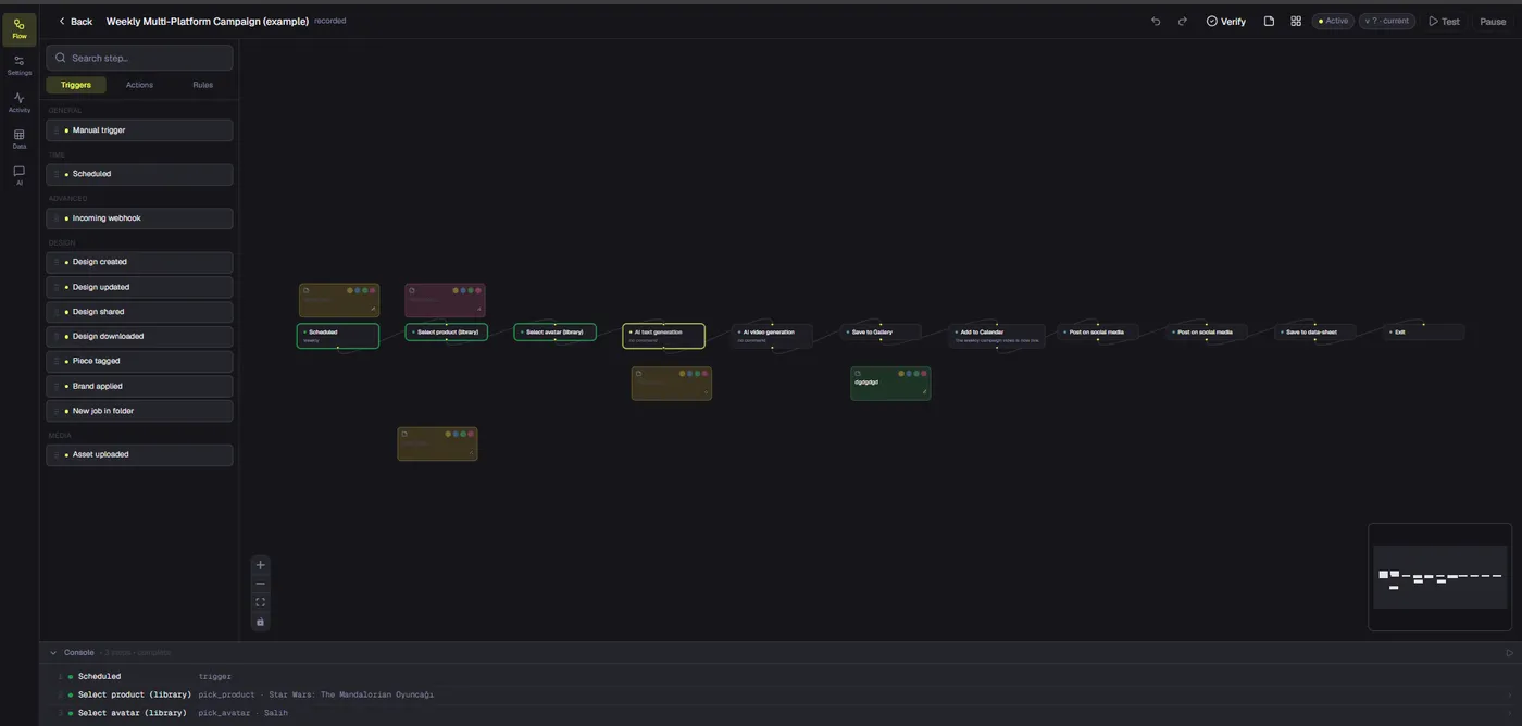
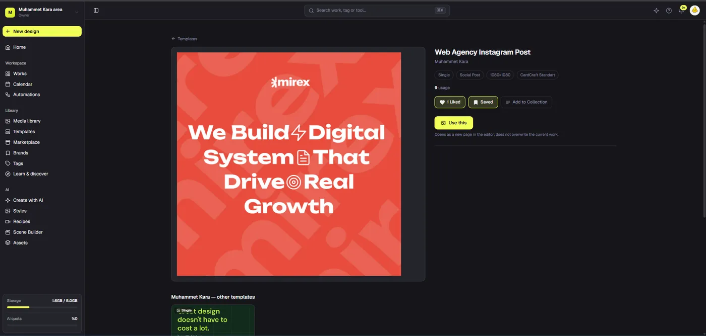
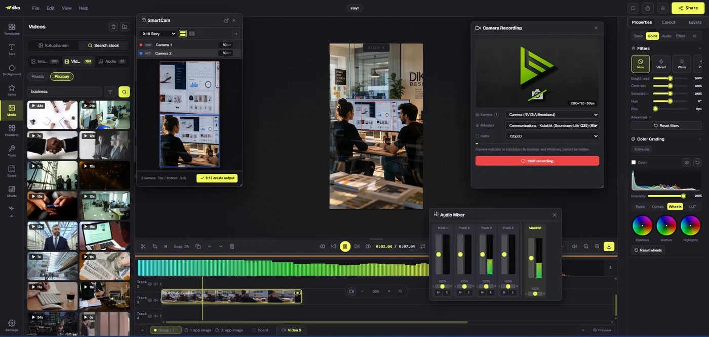
Resizing social media graphics is a layout problem, not merely a width-and-height change. A square post, vertical story, and wide banner can share a campaign identity while needing different text hierarchy, image crop, and safe-area treatment. This guide gives a practical duplicate-resize-review workflow, with Dika Studio behavior described accurately: changing the canvas does not automatically move or scale its objects.
Why resizing a canvas is not resizing a design
To resize social media graphics safely, separate the canvas dimensions from the composition inside it. Changing a square artboard into a vertical story changes available space and aspect ratio. It does not decide where the headline should move, which image crop remains useful, or whether the logo is too close to an interface overlay. Those are editorial and visual decisions.
In Dika Studio, documented Resize controls change the canvas size while existing objects retain their position and size. Nothing automatically reflows. That is a useful, predictable foundation, but not an automatic conversion tool. A creator must reposition text, scale images proportionally, rebalance spacing, and review each result. Any guide that promises one-click perfect layouts would mislead the team using this workflow.
Start with a source design that has clear hierarchy and editable objects. If the only source is a flattened image, altering proportions often means cropping out content or stretching the entire graphic. Keeping the headline, image, logo, and supporting details as separate objects makes thoughtful adaptation possible without recreating every element.
Choose destinations before creating the first layout
List the formats you actually need: feed post, story, ad, banner, and any client-specific size. A template should be designed with those destinations in mind, even if you start with one master. Identify the narrowest and widest aspect ratios, and decide which elements are essential in each. If a vertical story needs a different photograph or shorter copy, capture that requirement before export day.
Use current platform presets as a starting point rather than typing dimensions from memory. Platform specifications and interface safe areas can change. Studio documentation lists social presets and exact size controls, but the publishing destination remains the final authority for upload requirements. Check current channel guidance before a campaign goes live instead of assuming last year’s numbers still apply.
Name each destination version clearly. Instagram Story, LinkedIn Banner, and Square Feed tell reviewers what each canvas is for. A design named copy 3 will be hard to audit later. If the campaign has several languages, include language in the page name as well, because text expansion can change layout even when dimensions stay constant.
Duplicate first so the approved source stays intact
Finish and review one starting composition, then duplicate its page before changing dimensions. Dika Studio documentation describes a page duplicate command that copies objects, background, and size to a new tab. Rename the duplicate for its destination. This gives you a safe working variant while leaving the approved source unchanged.
Choose the existing version closest to the new aspect ratio when making later variants. A vertical story is a better parent for another vertical placement than a wide banner. This reduces repositioning but does not eliminate it. The duplicate is an editable starting point, not a final adaptation.
Keep original and variants together in a project or group if that matches your workflow. Reviewers should be able to identify which page is the source and which are production outputs. Do not overwrite the source when experimenting; if a resize fails, discarding the duplicate is faster and safer than reconstructing the original.
Change the canvas, then rebuild the hierarchy
On the duplicate, deselect objects and use the size controls or a matching platform preset. Once the canvas changes, inspect what is now outside the safe area, what appears too small, and where empty space has opened. Move the primary message first, then image, then supporting details and logo. Re-establish a coherent reading order instead of shifting every object by the same number of pixels.
For a square-to-vertical adaptation, a side-by-side headline and image may need a stacked composition. Shorten the headline if the story format cannot accommodate it legibly. For a square-to-wide banner, the image can occupy one side while copy sits on the other. Do not simply stretch the square to the new dimensions; the typography, faces, and logo would distort.
Check relationships, not just coordinates. The headline should be visibly dominant, the call to action should be findable, and the brand mark should remain present without competing with the message. Use alignment guides and exact position controls when precision matters, but judge the finished balance visually at intended viewing size.
Preserve image proportions and subject matter
Image crops fail when the focal point sits near a boundary that disappears in the new format. Before resizing, identify the subject: product, person, interface element, or scene. Keep that subject visible and large enough to understand. If the source photograph cannot support both wide and vertical versions, choose a different crop or an alternate approved image. A template should never force a critical product detail out of frame.
Dika Studio’s documented object resize uses corner handles proportionally by default. The Alt-modified corner action and mid-edge handles can break proportions. Use free stretching only for objects designed to tolerate it. Logos, faces, product packaging, and interface screenshots generally should not be distorted. Preserve their aspect ratio and adjust crop or placement instead.
Preview image quality after export. Enlarging a small source can create blur even if the crop looks acceptable in the editor. Use sufficiently detailed first-party or properly licensed assets, and keep the final displayed size in mind. A sharp square source may still be a poor vertical candidate if its subject cannot be framed without losing context.
Set text rules for each format
Text that works in a feed graphic may be too dense for a story or too small for a banner viewed in a narrow page section. Establish a maximum headline length for each variant, a minimum readable type size, and a clear fallback when copy is too long. The fallback might be an alternate layout, a shorter approved line, or moving detail into the caption. Shrinking text until it technically fits is not a reliable design strategy.
Revisit line breaks manually. Different widths alter where a phrase wraps and which word gets emphasis. Keep important claims together, avoid a single orphan word at the end of a headline, and check whether a price or date remains visually connected to its label. Multilingual campaigns need extra margin for expansion and different word lengths.
Maintain contrast after moving text over a new area of an image. A high-contrast headline on the square may land over a bright section in the vertical crop. Use an approved overlay, background block, or alternate image rather than reducing legibility. Review text at phone size and in grayscale if the design uses color to communicate state or hierarchy.
Respect channel interface and safe areas
A platform can cover parts of a creative with buttons, captions, profile information, or navigation controls. Leave breathing room around critical text and calls to action. Because platform interfaces evolve, treat safe-area numbers as values to verify for the current placement, not as permanent constants embedded in every template.
Keep essential information away from edges even when a tool shows the full canvas. A clean export can still look crowded once placed inside a feed card or story player. Check a mock placement or actual preview when available. If the channel crops thumbnails differently from full view, inspect both states.
For paid campaigns, confirm placement-specific policies, file limits, and disclosures. A graphic optimized for an organic story may require changes for an advertisement. Resizing is not an excuse to omit legal text or hide a material condition. If the required disclosure cannot remain readable, use another layout or placement.
Protect brand consistency while adapting
Shared identity does not require identical arrangement. Carry forward approved palette, typography, image treatment, and logo use, but allow hierarchy to change with the format. A wide banner and a vertical story can feel like one campaign even when the image and text swap positions. Consistency comes from repeated decisions, not one frozen geometry.
Use a brand kit as a reference, not an automatic transformation promise. Dika Studio documentation states there is no one-click brand push for every variant; creators apply colors and logo choices manually. When a duplicate is resized, review whether those choices still serve contrast and recognition. Avoid making a logo larger merely because the new canvas has empty space.
Record format-specific exceptions. Maybe a secondary color replaces the usual background in a dark story placement, or a stacked lockup is required for vertical work. Explain why the exception exists so the next campaign does not accidentally treat it as a new default.
What changes when format changes?
| Element | Keep consistent | Reconsider per format |
|---|---|---|
| Brand identity | Approved mark and palette | Lockup size and placement |
| Headline | Core message and font family | Length, breaks, alignment |
| Image | Subject and treatment | Crop, focal point, scale |
| Call to action | Action intent | Placement and safe area |
| Export | Campaign naming | Dimensions and placement preview |
Review variants side by side
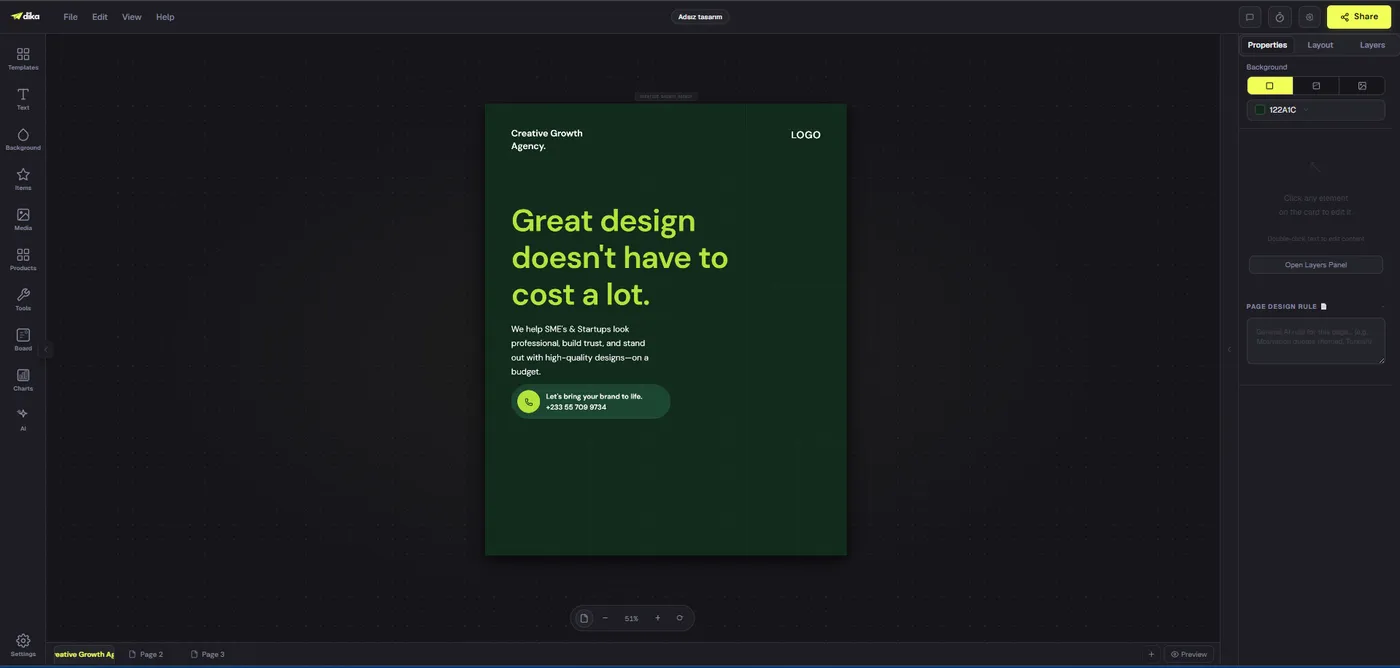
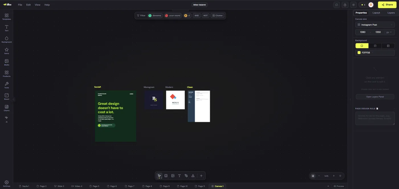
A multi-page view can reveal drift that is hard to notice one design at a time. Compare headline size, logo prominence, color balance, image treatment, and call-to-action placement across the family. Dika Studio’s infinite canvas screenshot shows several design pages visible in one workspace; that is a useful visual reference for variation review, not proof of automatic conversion.
Inspect each variant individually too. Side-by-side comparison catches inconsistency, but only an at-size check catches small text or weak contrast on a phone. Export test files and view them where they will be used. If a reviewer is likely to see a thumbnail, review the thumbnail as well as the full image.
Ask someone unfamiliar with the source design to identify the campaign message in each size. If one variant communicates a different priority, adjust it. A strong resize process preserves the intended story, not merely the same collection of objects.
Common mistakes and better fixes
Stretching the whole composition is the fastest way to damage logos and photographs; resize objects proportionally and rebuild their positions. Letting a headline overlap the image subject is another common failure; move either the text or the crop. Keeping every supporting line in a narrow story creates a crowded result; prioritize essential information and move secondary detail to the caption where appropriate.
Starting every destination from the original square can create needless work. Duplicate the closest approved variant. Conversely, repeatedly duplicating a version that already contains accidental layout compromises can compound defects. Keep a clean master and review the parent before making another copy.
Do not assume a preset guarantees channel readiness. Presets establish dimensions, not content quality, rights, safe-area compliance, or current platform policy. Treat them as a measurement aid. The final QA still needs the human questions: is the subject visible, is the copy accurate, is the action clear, and is the export technically acceptable?
A repeatable resize checklist
For each destination, duplicate the nearest approved page, rename it, choose the current size preset, and inspect all objects that moved out of balance. Rebuild hierarchy, crop without distortion, revise line breaks, and check contrast. Confirm logo placement and safe areas. Export at intended resolution, then review on a device or realistic preview.
Keep a checklist in the project so a fast handoff does not depend on memory. Record destination, dimensions, variant owner, review date, and export name. If a platform changes its preferred size, you will know which variants require fresh export rather than guessing from a folder of similar files.
Measure success by how much work can be reused without carrying mistakes forward. A good source design speeds up adaptation, while a good review process prevents a fast resize from becoming a public correction. Repeat the workflow on two formats first, then add more once the method is stable.
Where to go next
If you are building the initial system, our social media design templates guide explains how to create an editable master and test it with real content. For detailed steps, consult the Dika Studio social-post tutorial.
Explore the Dika Studio product overview to see the design workspace, then test one source design against a square, vertical, and wide destination. Keep the original untouched and compare the exports. The goal is not to avoid every manual adjustment. It is to make each adjustment deliberate, reversible, and fast enough for recurring production.
Frequently asked questions
Does Dika Studio automatically reflow a design when I resize it?
No. Its documentation says the canvas dimensions change while existing objects keep their positions and sizes. Reposition and resize objects manually.
Should I duplicate a social post before changing its size?
Yes. A duplicate preserves the approved source and gives you a reversible variant for the new destination.
Can I use a platform preset rather than typing dimensions?
Yes. Dika Studio provides social and other size presets. Confirm current destination requirements before publishing because platform specifications can change.
What should move first after a resize?
Rebuild the primary message hierarchy first, then image, supporting information, logo, and call to action. Check relationships rather than moving every object uniformly.
How do I stop photos and logos from stretching?
Keep their aspect ratio and adjust crop or placement. In the documented editor, proportional corner resizing is the default; avoid actions that stretch one axis for these assets.
Should every format use the same amount of text?
No. Shorten or redistribute supporting copy when narrow placements would make it unreadable. Preserve core message and required disclosures.
What is a safe area?
It is the region where important content remains clear of channel interface overlays and likely cropping. Verify current guidance for the specific placement.
Can I make a wide banner from a square post?
Yes, but changing canvas dimensions is only the first step. Rebalance the composition, image crop, line breaks, and spacing for the wide layout.
How do I review a family of resized posts?
Compare variants side by side for identity and hierarchy, then inspect each export at its intended size or in a realistic channel preview.
What should I keep from the original design?
Keep campaign identity, key message, approved visual assets, and an untouched editable source. Adapt their arrangement to each format.